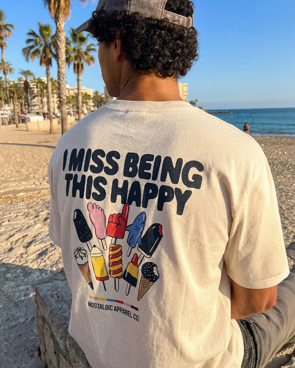
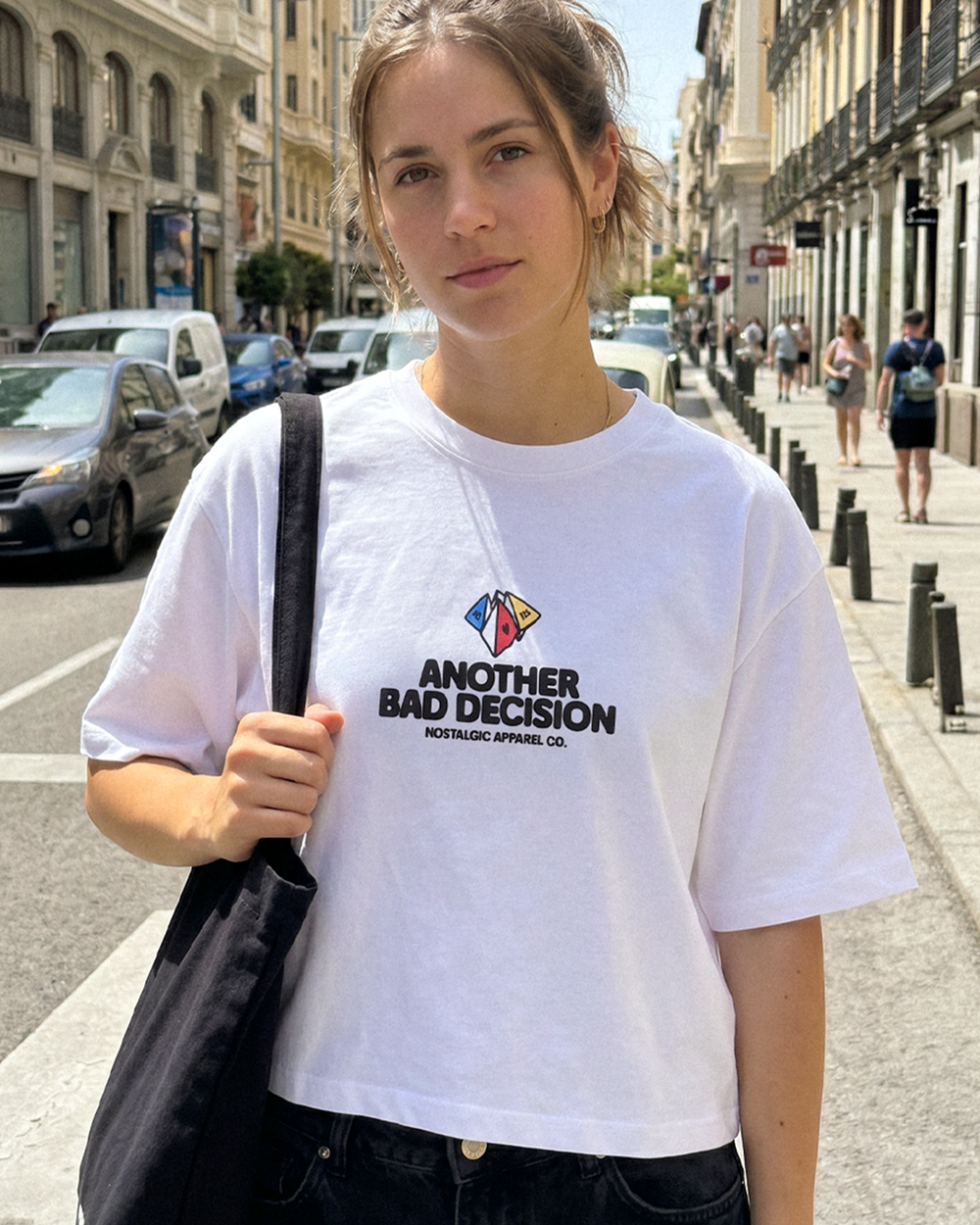
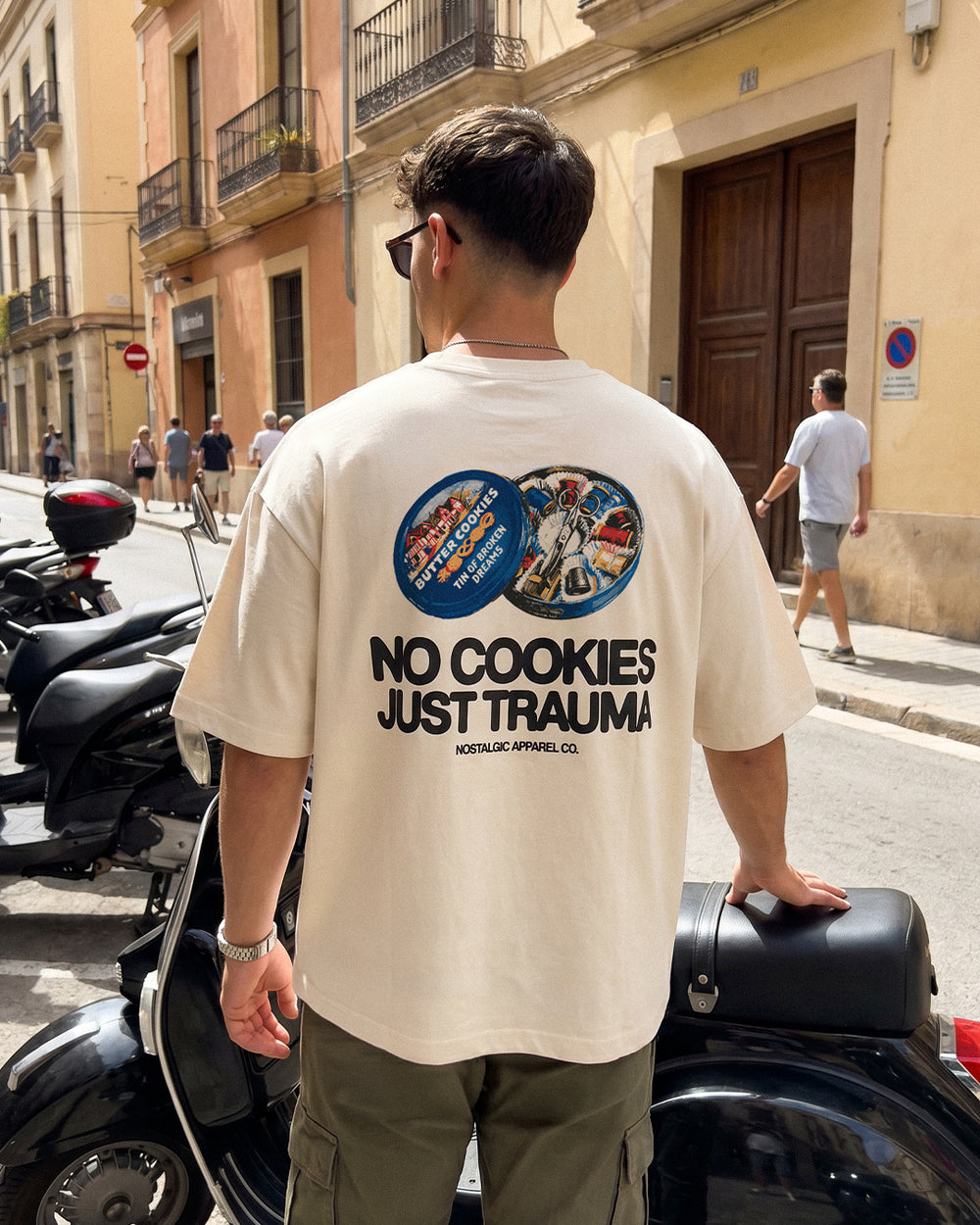
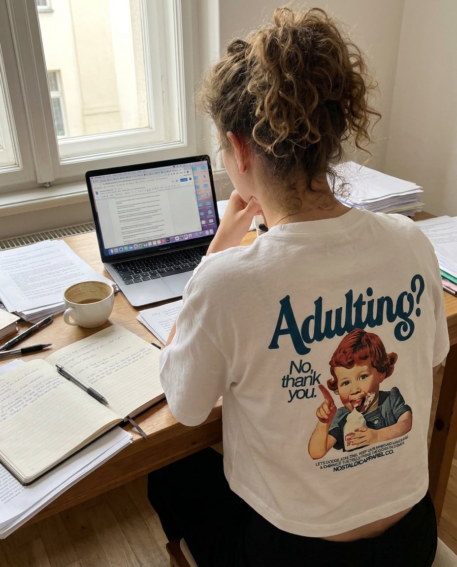
Every piece we release starts as an idea that won't leave us alone. A frame from a film. A color combination from an old advertisement. A feeling we had playing a game at 2 AM when we were fourteen. The best designs don't come from briefs or brainstorms — they come from obsession.
We get asked a lot about how we create our prints. The honest answer is that it's messy, nonlinear, and deeply personal. But there is a method behind the chaos, and we want to share it with you.
It Starts with a Reference
Our design process always begins with cultural archaeology. We dig into the visual language of the decades we love — the 80s, 90s, and early 2000s — looking for moments that still carry emotional charge.
That might mean spending hours scrolling through vintage magazine scans, watching obscure films, revisiting album artwork, or playing retro games and paying attention to their pixel art and UI design. We're not looking for things to copy. We're looking for sparks. The goal is to find a visual idea that triggers recognition — something that makes you feel before you think.
We keep running lists of references: color palettes from VHS covers, typography from arcade cabinets, composition techniques from comic books, texture patterns from old sportswear catalogs. These lists grow constantly. Most of them never become products. But the ones that do have been living in our heads for months before they ever hit a screen.
The Mood Board Phase
Once a concept has enough gravity, we build a mood board. This is where the abstract becomes visual. We collect images, color swatches, type samples, and textures that orbit the core idea.
A mood board for a single design might include a screenshot from an 80s anime, the dashboard of a 1992 Toyota, a faded concert poster, and a Pantone chip from a forgotten brand identity. The connections aren't always obvious, and that's the point. We're building an atmosphere, not a blueprint.
This phase usually takes a few days. We add, remove, rearrange. We argue about whether something belongs. We step away and come back with fresh eyes. The mood board is done when it feels like a world — small but complete.
From Sketch to Screen
With the mood board as our compass, we start sketching. Pen on paper first, always. There's something about the imprecision of hand-drawing that produces ideas a mouse never would. Mistakes become features. Crooked lines suggest movement. Rough proportions reveal character.
The best sketch concepts then move to digital. We work primarily in vector, which allows us to scale designs without losing quality and to fine-tune every curve and angle. This is where the design goes from rough energy to controlled precision. We preserve the soul of the sketch while cleaning up the execution.
Typography is often the hardest part. We rarely use existing fonts straight out of the box. Most of our type is custom-drawn or heavily modified — stretched, distorted, aged, or combined with hand-lettered elements. The lettering in a design should feel as intentional as the illustration. It's not decoration. It's voice.
Color Is Everything
We spend more time on color than most people would expect. A design can change completely — its mood, its era, its audience — based on the palette you choose. We test every design in multiple colorways before committing.
Our palettes lean toward specific decades. Warm terracotta, mustard, and teal for the 80s. Deep purple, forest green, and faded black for the 90s. Bright pink, digital blue, and chrome silver for Y2K. But we're not rigid about it. Sometimes the best results come from crossing timelines — pairing an 80s illustration with a 2000s color scheme, or a 90s font with a retro-futuristic palette.
We also consider the garment color at this stage. A design that looks incredible on a white tee might completely lose its impact on black, and vice versa. We design for specific fabric colors, not in isolation.
Print Testing and Quality Control
Digital design is only half the job. The other half is making sure it translates perfectly onto fabric. Screen printing, DTG, and other techniques each have their own characteristics, and a design needs to be optimized for whichever method we choose.
We run test prints on the actual garment blanks we use — same cotton weight, same fabric composition. Colors can shift dramatically between screen and fabric, so we adjust until the print matches our vision. This sometimes means reformulating ink mixes or adjusting the design's color values to compensate for how the fabric absorbs pigment.
We also test durability. Our prints need to survive washing, wearing, and living in. If a design fades or cracks after a few cycles in the machine, it doesn't ship. Period.
The Final Piece
When a design passes every test — visual impact, color accuracy, print quality, durability — it earns its place in the collection. By this point, it's been weeks or sometimes months since the initial spark. What started as a fleeting reference has become a physical object you can hold, wear, and make your own.
That journey is what makes every piece meaningful to us. We don't produce designs at volume or speed. We produce them at the pace of care. And we think you can feel the difference when you put one on.
See the results for yourself.